Wednesday 1 March 2023

FINDING A MISSED FILE IN THE PC BY THE SHELL


Have you ever created a file and forgotten where you saved it and its name?


You might want to search it through the last modification date
In Windows it can be tricky, but with Git Bash can be very easy and fast (in Linux should work as well).

At the end of the post you can find the recap of the code!


Firstly, open Git Bash directly in the main directory you want to search for the file.
In this example, I opened it in the directory called Shell, since my file is there, somewhere.

Now, you make a list ('ls') of all the files in this directory and its subdirectories, which displays also the last modification date.
However, you do not want to see this list (it might be very long!), but search in it and see only the wanted results.
Hence, you'll use the pipe ('|') to concatenate the command 'grep' and search by date:

    ls -lR | grep 'Feb 23'

# the -l flag gives you a list that includes the last modification date
# the -R flag is for searching all the subdirectories 


Pay attention when writing the date! The format should be:

        abbreviation of the month + space + 2 numbers for the day +  space + year 

but if the number for the day is only one, then use 2 spaces:
    
    'Feb  3  2023'

You are not obliged to use all these elements, you can choose. But be sure it is the same format as the output of 'ls -l' or you'll get no results. You can have an idea of it just doing:

    ls -l    #it will list the files in the working directory


This is what you get:


The arrow indicates the file we are looking for.


Now you want to know the path of the file, to find it. Use the 'find' command and pass to it the name of the file just found (copy/paste):

    find -name 'shell_data.tar.gz'


It gives you the RELATIVE PATH so now you can find the file!


If you want the FULL PATH, you need to navigate to the folder with 'cd' and use the 'readlink' command with the '-f' flag:

    cd 'Shell lessons -Carpentry_2023'/'materiale per lezione'
    readlink -f 'shell_data.tar.gz'


Now you can even copy/paste the path in the windows bar, press Enter and it will bring you to the folder with the file.

Easy, right?

This is the recap of the code:

ls -lR | grep 'dateInTheSameFormatOfTheOutputOf_ls'
find -name 'FileName'

#optional:
cd 'relativePath'
readlink -f 'FileName'


I hope it makes your day!
If you have a better solution, I am curious to hear about it.


Saturday 19 November 2022

VOLCANO PLOTS CUSTOMIZATION IN R


Volcano plots became famous with big data analysis. Whether you are working with NGS, mass spectrometry data or similar, you might need to build this kind of plot.


The 'ggplot2' package is very useful for this purpose. I found a very nice post where instructions to build a basic volcano plot are provided, just have a look. I will start from there and add some lines of code to customize the plot, including how adding the lines of significance and highlighting specific genes of interest.

It’s gonna be a bit long guiding you step-by-step, but I hope you’ll find it useful!


Let's start with the packages:

library(dplyr)
library(ggplot2)
library (ggrepel)
library(dslabs)


From the post I mentioned, I’ll use this function to have a nicer output for showing data (it is slightly modified compared to the original):

knitr_table <- function(x) {
                   x %>%
                   knitr::kable(format = "rst", digits = Inf,
                   format.args = list(big.mark = ","))
                            }


… and also the source of data:

data <- read_tsv("https://raw.githubusercontent.com/sdgamboa/misc_datasets/master/L0_vs_L20.tsv")

dim(data) #it shows the data dimensions (rows, columns)

head(data) %>%
    knitr_table() #to show the first 6 lines


These are analysed data from RNA sequencing, so you can find the variables of interest for building a volcano plot:

Genes: it contains the names of each gene

logFC: it contains the logarithm base 2 (log2) of the fold change of each gene

PValue: it contains p-values for each comparison

FDR: false discovery rate


We will use the FDR column, whose values need to be converted to their negative logarithm base 10 [log10(FDR)]. We’ll do it later, in the ‘ggplot()’ function.


DIFFERENTIALLY EXPRESSED GENES (DEGs)


Now that we got the data, it is necessary to add a column with the indication about the differentially expressed genes (DEGs). Usually, they are those with an FDR equal to or lower than 0.05, and a fold change equal to or higher than 2.

Therefore, we’ll add the variable “Expression” where classifying the genes as up-/down-regulated or unchanged according to the FDR and fold change:

data$Expression <- 
        ifelse((data$FDR <= 0.05 & data$logFC <= -1), "Down-regulated", 
                ifelse((data$FDR <= 0.05 & data$logFC >= 1), "Up-regulated",
                "Unchanged"))               

Where 1 is the log2(2).

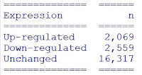
Now, it is possible to count how many genes are up-/down-regulated or unchanged:

data %>%
    count(Expression)
    knitr_table()


… as well as to get a data frame with up-regulated genes and down-regulated genes, in descending order based on logFC. It can be exported if needed:

up <- data %>%
           filter(Expression == "Up-regulated") %>%
           arrange(desc(logFC))

down <- data %>%
           filter(Expression == "Down-regulated") %>%
           arrange(desc(abs(logFC)))

head(up) %>%
    knitr_table()

library(rio)
export(up, "up-regulated genes.xlsx") #to export the table to an excel file in the working directory

You can do the same with down-regulated genes.


BUILDING THE BASIC VOLCANO PLOT


Now we will build the basic volcano plot, remembering to convert the FDR to its log base 10 and assigning the colour to “Expression”:

p1 <- ggplot(data, aes(logFC, -log(FDR,10))) +
      geom_point(aes(color = Expression), size = 1.8, shape = 19, alpha = 0.3) +
      xlab(expression("log"[2]*"FC")) +
      ylab(expression("-log"[10]*"FDR")) + 
      scale_color_manual(values = c("deeppink1","orangered", "gray50")) +
      theme_bw()

windows(width=10, height=7); par(lwd=1, las=1, family="sans", cex=1,
  mgp=c(3.0,1,0))

p1


ADDING THE LINES FOR SIGNIFICANCE


We first have to set the values for the lines on the x and y axes:

y <- -log(0.05,10)  #this is for the FDR, the log base 10 of 0.05

x <- log(2, 2)  #this is for the fold change, the log base 2 of 2

p2 <- p1 +

      geom_hline(yintercept = y, col = "black", linetype = "dotdash") + #add an horizontal line at point y
      geom_vline(xintercept = c(x, -x), col = "black", linetype = "dotdash") #add a vertical line at point                                                                                        x and -x

windows(width=10, height=7); par(lwd=1, las=1, family="sans", cex=1,
  mgp=c(3.0,1,0))

p2


It calls to mind Japanese cherry blossom, doesn't it?

As a final step, you might want to highlight some genes of interest and add the labels.  


SELECTED GENES


Let's select those genes with 'filter()' in the 'dlpyr' package: 

labels <- data %>%
          filter(Genes == "57_45" | Genes == "1092_3" | Genes == "144_7" |
                 Genes == "468_3" | Genes == "29_188" | Genes == "1192_1")

Now we'll over-write them in the plot we built: 

windows(width=10, height=7); par(lwd=1, las=1, family="sans", cex=1,
  mgp=c(3.0,1,0))

p2 +
  geom_point(data = labels,
             mapping = aes(logFC, -log(FDR,10)), size = 1.8) + #this is for the points
  geom_label_repel(data = labels,
                   mapping = aes(logFC, -log(FDR,10), label = Genes), size = 2) #this is for the labels


Basically, inside the ‘geom_point()’ or the ‘geom_label_repel()’ the data you specify are the ones included in the previously prepared subset ‘labels’ and the mapping corresponds to the x and y of each point.

The ‘geom_label_repel()’ function, will move slightly the labels to avoid their overlapping. You can change the colour, size and shape of the highlighted points with the specific arguments in ’geom_point()’.


TOP GENES

To highlight the top genes we can use the ordered up-regulated and down-regulated genes we previously saved in the objects “up” and “down”.

We’ll select only the top 10 genes for up-regulated and down-regulated ones, and put them together in a data frame:

top_genes <- bind_rows(up %>% head(n=10),
                       down %>% head(n=10))

top_genes %>%
    knitr_table()

Now we can use this data frame similarly to the previous example: 

windows(width=10, height=7); par(lwd=1, las=1, family="sans", cex=1,
  mgp=c(3.0,1,0))

p2 +
  geom_point(data = top_genes,
             mapping = aes(logFC, -log(FDR,10)), size = 1.8) + 
  geom_label_repel(data = top_genes,
             mapping = aes(logFC, -log(FDR,10), label = Genes), size = 2)


SINGLE GENE


Finally, it is possible to highlight a single gene in this way:

windows(width=10, height=7); par(lwd=1, las=1, family="sans", cex=1,
  mgp=c(3.0,1,0))

p2 +
  geom_point(data = subset(data, Genes == "144_7"),
             mapping = aes(logFC, -log(FDR,10)), size = 1.8) +
  geom_label_repel(data = subset(data, Genes == "144_7"),
                   mapping = aes(logFC, -log(FDR,10), label = Genes), size = 2)


I hope this post will be useful as a kick-start. You can further customize the plot according to your needs, you have plenty of options. 
Have fun!

@colour credits: Peruzzella&Cinderella®


Sunday 11 April 2021

BUILDING DOT PLOTS IN R SIMILAR TO THOSE WITH GraphPad


Have you ever had the necessity to build a dot plot in R that looks like the nice ones obtained with GraphPad?


Here, an example of what I am talking about:


To show you the solution I found, I'll use the chickwts preloaded dataset and ggplot2.

First, we'll load the packages and data needed:

library(ggplot2)
library(dplyr)
data(chickwts)  #the dataset shows chicken weights depending on food type 


In our example, we'll shorten the dataset to show only the weights in the sunflower and soybean group:

Dataset <- chickwts %>%
   filter(feed == "sunflower" | feed == "soybean")


Using the geom_dotplot() function, we can build the following graph:


As you can see, it shows the individuals as dots, coloured by category, with a black bar indicating the mean of the group.
Here, you have the code:

Dataset %>%
ggplot(aes(feed, weight, fill = feed)) +
geom_dotplot(binaxis = "y", stackdir = "center", stackratio = 1, #stackratio moves the dots                                                                                       #towards the left or the right
  dotsize = 0.7, binpositions = "all") +
stat_summary(fun = mean, geom = "crossbar", width = 0.7) +  #width change the length of the bar
theme_bw()


If you want to change the colour of the bar, you can do it by adding the colour argument in stat_summary().
In the following example I gave it the same colour of the dots:

Dataset %>%
ggplot(aes(feed, weight, fill = feed)) +
geom_dotplot(binaxis = "y", stackdir = "center", stackratio = 1, 
  dotsize = 0.7, binpositions = "all") +
stat_summary(fun = mean, geom = "crossbar", width = 0.7, 
col = c("#9E0142","#3288BD")) +
scale_fill_manual(values = c("#9E0142","#3288BD")) +
theme_bw()


Arrived at this point, you could be still disappointed because the graph is not that similar to the original one.
So, since in geom_dotplot() is not possible to change the shape of dots, what to do?

The geom_jitter() function can help us:

Dataset %>%
ggplot(aes(feed, weight, fill = feed)) +
geom_jitter(aes(shape = feed, col = feed), size = 2.5, width = 0.1)+
stat_summary(fun = mean, geom = "crossbar", width = 0.7,
col = c("#9E0142","#3288BD")) +
scale_fill_manual(values = c("#9E0142","#3288BD")) +
scale_colour_manual(values = c("#9E0142","#3288BD")) +
theme_bw()


Changing the width argument in geom_jitter() you can move a bit the points, so they do not overlap. 
The use of both scale_fill_manual() and scale_colour_manual() allows giving the same colour to the legend and dots.


Although it is not exactly the same, it looks pretty similar to the first one, doesn't it?


And now the final customization.
Perhaps you would like to choose the symbols displayed. In this case, you can add a layer with scale_shape_manual():

Dataset %>%
ggplot(aes(feed, weight, fill = feed)) +
geom_jitter(aes(shape = feed, col = feed), size = 2.5, width = 0.1)+
stat_summary(fun = mean, geom = "crossbar", width = 0.7,
 col = c("#9E0142","#3288BD")) +
scale_fill_manual(values = c("#9E0142","#3288BD")) +
scale_colour_manual(values = c("#9E0142","#3288BD")) +
        scale_shape_manual(values = c(18, 25)) +
theme_bw()


You can find the symbols used in R here.

I hope you found this post useful.
As usual, if you have a better solution, please let me know!

Tuesday 17 July 2018

GETTING THE AUTHORISATION TO MODIFY A FOLDER/FILE (changing permissions)


Are you trying to modify a file/folder but you have not the authorisation? Did you get back a message like the following?


"You are not allowed to open the file. Ask the owner or the admin for getting the authorisation"


Try to follow this step-by-step easy guide:


1. Click right on the folder/file

2. Select Properties from the Context Menu

3. In the Security tab click on the "Edit" button


4. In the first box Users and Groups select "Users" and in the second box Authorisation for Users check "Allow" on "Complete Control"


5. Finally click on Apply button and you will be able to modify your folder/file.

For additional methods, you can have a look at this link.

If you have a better technique, please let me know!

Monday 18 December 2017

LITTLE TROUBLESHOOTING IN R

Using R, little troubles can arise. Below, a "work in progress" collection of solved problems...or not yet...


If you have your own solution or wish to discuss some topics, your contribution will be welcome.


  • ERRONEOUSLY SAVED WORKSPACE


If you want to delete the workspace you saved, check into the Documents folder and delete both files that appear as "R Workspace" and "Rhistory". That's all!!


  • FISHER'S EXACT TEST ERROR MESSAGES: "FEXACT error 6 and 7"

Have you ever got error messages performing Fisher's exact test? Well, I have got two different error messages that I solved with the same "tricks":

  Error in fisher.test(.Table) : FEXACT error 7.
  LDSTP is too small for this problem.
  Try increasing the size of the workspace.

OR

  Error in fisher.test(.Table) : FEXACT error 6.
  LDKEY is too small for this problem.
  Try increasing the size of the workspace.


As suggested, you can first try to increase the workspace to 2e8 or 2e9: 

  fisher.test(data,workspace=2e8)  #change data with the name of your table


If it still doesn't work, you can go for a simulation:

  fisher.test(data,simulate.p.value=TRUE,B=1e7)

where simulate.p.value is a logical for computing p-value by Monte Carlo simulation and B indicates the number of replicates (by default B=2000), that can be changed as needed.
I know, it is not exactly the same...but at least you can run the analysis.

As usual, if you have a better solution, please let me know!


  • NEW VERSION NOT WRITABLE: " '/R-X.X.X/library' is not writable"

Have you just updated the R version but can't update the library because the folder is not writable?

Don't worry! You have two different options:

1. the easiest way is to create a private library. Just say "Yes" when R will ask you (and take note of the location of the folder);

2. if you still want to write in the library folder, you can get the authorisation following the easy instructions I provided in this post.


  • ANOVA ERROR MESSAGES: "Error in eigen" OR "Error in contrasts"

If you perform a mixed ANOVA, either using
aov() or anova_test() (from rstatix package), you could run into these error messages:

  Error in eigen(SSPE, only.values = TRUE) : 
  infinite or missing values in 'x'

OR

  Error in `contrasts<-`(`*tmp*`, value = contr.funs[1 + isOF[nn]]) : 
  contrasts can be applied only to factors with 2 or more levels


In both cases, the problem is represented by missing values (NA).

If you prepare your data excluding NA for your dependent variable with filter(), you will get the first message because there will be no values corresponding to that case in that particular level of the independent variable.

If you decide to solve the problem by eliminating the row with the NA from the dataset, you will get the second error message because R will miss completely that case in that particular level of the independent variable.

To avoid this problem you should remove the rows with that specific case at any level of the independent variable, including those where the value is not missing.

Of course, this can represent a loss of data.

One easy possibility is to substitute the NA with the mean of the group at that level of the independent variable.

However, to decide how to handle missing values, I suggest going on with further readings.