Volcano plots became famous with big data analysis. Whether you are working with NGS,
mass spectrometry data or similar, you might need to build this kind of plot.
The '
ggplot2' package is very useful for this purpose.
I found a very nice
post where instructions to build a basic volcano plot are provided, just have a look. I will start from there and add some lines of code to
customize the plot, including how
adding the lines of significance and
highlighting specific genes of interest.
It’s
gonna be a bit long guiding you step-by-step, but I hope you’ll find it useful!
Let's start with the packages:
library(dplyr)
library(ggplot2)
library (ggrepel)
library(dslabs)
From
the
post I mentioned, I’ll use this function to
have a nicer output for showing data (it is slightly modified compared to the
original):
knitr_table <- function(x) {
x %>%
knitr::kable(format = "rst", digits = Inf,
format.args = list(big.mark = ","))
}
…
and also the source of data:
data <-
read_tsv("https://raw.githubusercontent.com/sdgamboa/misc_datasets/master/L0_vs_L20.tsv")
dim(data) #it shows the data dimensions (rows, columns)
head(data) %>%
knitr_table() #to show the first 6 lines
These
are analysed data from RNA sequencing, so you can find the variables of interest
for building a volcano plot:
Genes: it contains the names of each gene
logFC: it contains the logarithm base 2 (log2) of the fold change of each gene
PValue: it contains p-values for each comparison
FDR:
false discovery rate
We
will use the FDR column, whose values need to be converted to their negative
logarithm base 10 [log10(FDR)]. We’ll do it later, in the ‘ggplot()’ function.
DIFFERENTIALLY EXPRESSED GENES (DEGs)
Now
that we got the data, it is necessary to add a column with the indication about the
differentially expressed genes (DEGs).
Usually, they are those with an FDR equal to or lower than 0.05, and a fold change
equal to or higher than 2.
Therefore,
we’ll add the variable “Expression” where classifying the genes as up-/down-regulated
or unchanged according to the FDR and fold change:
data$Expression <-
ifelse((data$FDR <= 0.05 & data$logFC <= -1), "Down-regulated",
ifelse((data$FDR <= 0.05 & data$logFC >= 1), "Up-regulated",
"Unchanged"))
Where 1 is the log2(2).
Now,
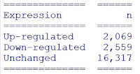
it is possible to count how many genes are up-/down-regulated or unchanged:
data %>%
count(Expression)
knitr_table()
…
as well as to get a data frame with up-regulated genes and down-regulated genes,
in descending order based on logFC. It can be exported if needed:
up <- data %>%
filter(Expression == "Up-regulated") %>%
arrange(desc(logFC))
down <- data %>%
filter(Expression == "Down-regulated") %>%
arrange(desc(abs(logFC)))
head(up) %>%
knitr_table()
library(rio)
export(up, "up-regulated genes.xlsx") #to export the table to an excel file in the working directory
You
can do the same with down-regulated genes.
BUILDING THE BASIC VOLCANO PLOT
Now
we will build the basic volcano plot, remembering to convert the FDR to its log
base 10 and assigning the colour to “Expression”:
p1 <- ggplot(data, aes(logFC, -log(FDR,10))) +
geom_point(aes(color = Expression), size = 1.8, shape = 19, alpha = 0.3) +
xlab(expression("log"[2]*"FC")) +
ylab(expression("-log"[10]*"FDR")) +
scale_color_manual(values = c("deeppink1","orangered", "gray50")) +
theme_bw()
windows(width=10, height=7); par(lwd=1, las=1, family="sans", cex=1,
mgp=c(3.0,1,0))
p1
ADDING THE LINES FOR SIGNIFICANCE
We
first have to set the values for the lines on the x and y axes:
y
<- -log(0.05,10) #this is for the FDR, the log base 10 of 0.05
x
<- log(2, 2) #this is for the fold change, the log base 2 of 2
p2 <- p1 +
geom_hline(yintercept = y, col = "black", linetype = "dotdash") + #add an horizontal line at point y
geom_vline(xintercept = c(x, -x), col = "black", linetype = "dotdash") #add a vertical line at point x and -x
windows(width=10, height=7); par(lwd=1, las=1, family="sans", cex=1,
mgp=c(3.0,1,0))
p2
It calls to mind Japanese cherry blossom, doesn't it?
As a final step, you might want to highlight some genes of interest and add the labels.
Let's select those genes with 'filter()' in the 'dlpyr' package:
labels <- data %>%
filter(Genes == "57_45" | Genes == "1092_3" | Genes == "144_7" |
Genes == "468_3" | Genes == "29_188" | Genes == "1192_1")
Now we'll over-write them in the plot we built:
windows(width=10, height=7); par(lwd=1, las=1, family="sans", cex=1,
mgp=c(3.0,1,0))
p2 +
geom_point(data = labels,
mapping = aes(logFC, -log(FDR,10)), size = 1.8) + #this is for the points
geom_label_repel(data = labels,
mapping = aes(logFC, -log(FDR,10), label = Genes), size = 2) #this is for the labels
Basically,
inside the ‘geom_point()’ or the ‘geom_label_repel()’ the data you specify are
the ones included in the previously prepared subset ‘labels’ and the mapping
corresponds to the x and y of each point.
The
‘geom_label_repel()’ function, will move slightly the labels to avoid their
overlapping. You can change the colour, size and shape of the highlighted points
with the specific arguments in ’geom_point()’.
TOP GENES
To
highlight the top genes we can use the ordered up-regulated and down-regulated
genes we previously saved in the objects “up” and “down”.
We’ll
select only the top 10 genes for up-regulated and down-regulated ones, and put
them together in a data frame:
top_genes <- bind_rows(up %>% head(n=10),
down %>% head(n=10))
top_genes %>%
knitr_table()
Now we can use this data frame similarly to the previous example:
windows(width=10, height=7); par(lwd=1, las=1, family="sans", cex=1,
mgp=c(3.0,1,0))
p2 +
geom_point(data = top_genes,
mapping = aes(logFC, -log(FDR,10)), size = 1.8) +
geom_label_repel(data = top_genes,
mapping = aes(logFC, -log(FDR,10), label = Genes), size = 2)
SINGLE GENE
Finally, it is possible to highlight a single gene in this way:
windows(width=10, height=7); par(lwd=1, las=1, family="sans", cex=1,
mgp=c(3.0,1,0))
p2 +
geom_point(data = subset(data, Genes == "144_7"),
mapping = aes(logFC, -log(FDR,10)), size = 1.8) +
geom_label_repel(data = subset(data, Genes == "144_7"),
mapping = aes(logFC, -log(FDR,10), label = Genes), size = 2)
I hope this post will be useful as a kick-start. You can further customize the plot according to your needs, you have plenty of options.
Have fun!
@colour credits: Peruzzella&Cinderella®


No comments:
Post a Comment